


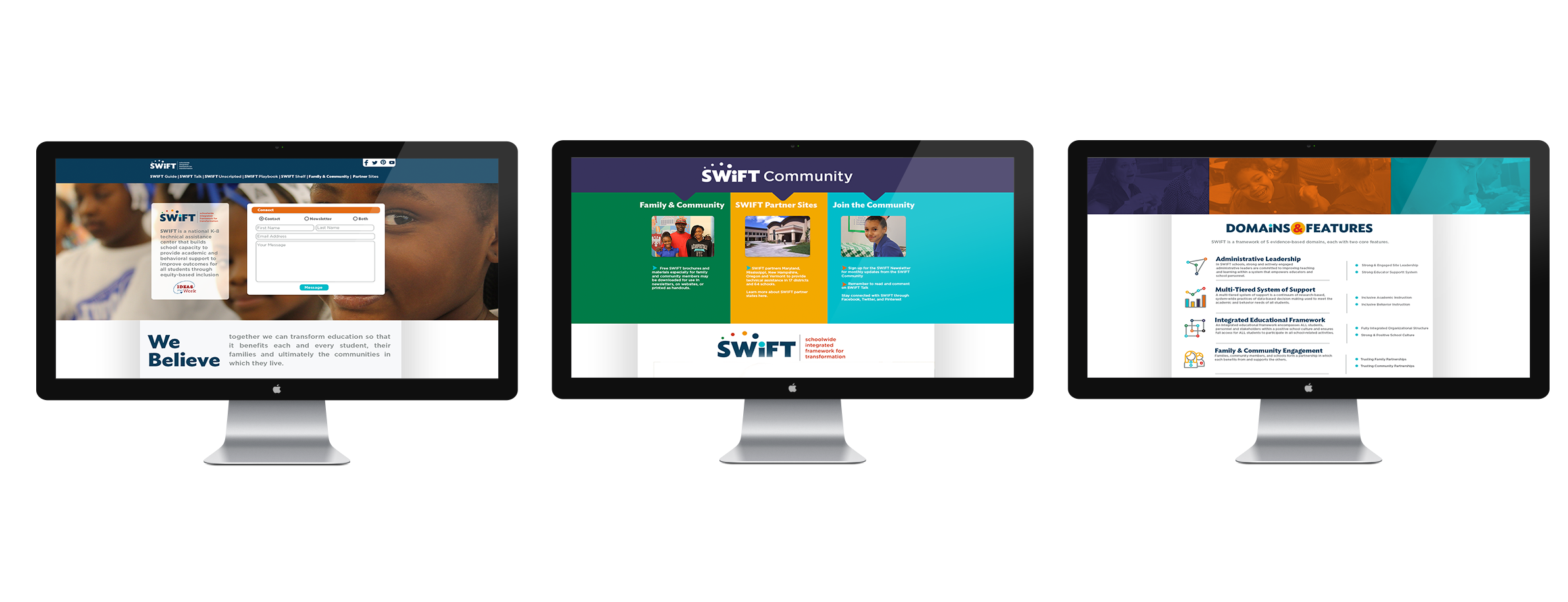


SWIFT is a national K-8 technical assistance center that builds school capacity to provide academic and behavioral support to improve outcomes for all students through equity-based inclusion. When the funding was granted for SWIFT by the Office of Special Education there was no visual brand or presence. The first branding was done quickly and congruently with the rest of the center. As the center was more and more defined the original branding did not have the flexibility to adapt with the center. The goals of the new brand were to create a logo that could be flexible with products and communications that were in development, focus on a visual language with bold colors and icons.
On the left are previous SWIFT products. An issue we had to address was to be more inclusive to people with eyesight issues. Gradient color through the logo type made it more difficult to read for some users
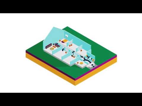
In this short video we describe how SWIFT works compared to current schools practices. Using simple shapes to represent faculty and students allowed us to focus on the message.